
The effect of colours on our mood
Can colours really affect our mood? Research says yes. Continue reading to find out more about which colour to paint your room or what to wear to work the next day.
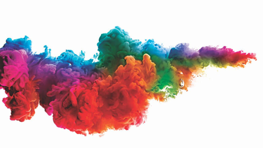
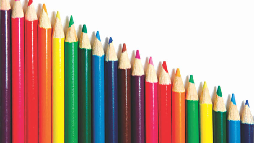
So, what exactly is colour psychology? As discovered by Sir Isaac Newton, white light disperses into the seven colours of the rainbow when it passes through a prism. He also found out that each colour has a different wavelength and cannot be further separated into other colours. There are four primary psychological colours — red, blue, yellow and green. However, anyone who has ever painted before knows that mixing different colours gives rise to other colours, for example mixing red and yellow gives orange.
 For all latest news, follow The Daily Star's Google News channel.
 Now that we know the details about colours, let's talk about some of their effects. Colours are called “warm” (e.g. red and orange) and “cool” (e.g. blue and green) because of the apparent change in temperature they make us feel. Entryways in colder climates are painted in warm colours and those in hotter climates are painted in cool colours to provide relief from the cold or heat to the person entering the building and make him/her feel more welcome.
Research shows that certain colours bring about distinctly different emotions and behavioural changes within us. Let us look at some of the most common colours in our daily lives and how they affect us.
RED: Red is described as a warm and vibrant colour which evokes intense emotions. Although it is often connected to feelings of anger and aggression, it is also the symbol of love and comfort. According to a survey, it is the boldest and most passionate colour that has the capability of making one feel powerful. Red is frequently used to catch somebody's attention, for example in build boards and traffic signage.
YELLOW: Yellow is often considered to be a cheerful and warm colour that is sure to lift our spirits and self-esteem. However, it is also one that causes the most eyestrain if one looks at it for too long due to the huge amount of light reflected. Although described as sunny, yellow can also give rise to aggression and frustration.
BLACK: Black is the perfect absorber of all light and since no light is reflected, it can often seem menacing to some as many people are afraid of the dark. It is primarily associated with evil, death and mourning, and creates a perception of seriousness. However, it is also a symbol of glamour and power and is hence used to represent treacherous characters such a Count Dracula and witches.
WHITE: Exactly the opposite of black, white is the perfect reflector of all light. It symbolises purity or innocence, hence the white gown that Western brides wear. It creates an illusion of space and designers often use this colour to make smaller spaces appear larger. While mostly positive, white can also be described as cold, lonely and sterile which is most evident in the white walls of hospitals.
BLUE: One of the world's favourite colours, blue is called the colour of the mind and is described as soothing, tranquil, serene and orderly. Blue is said to boost productivity and is therefore often used to paint office walls. To project an image of security, advertisement companies often use blue while marketing their products. However, it can also be a sign of aloofness, sadness or unfriendliness and this is said to be because of the apparent drop in pulse rate and body temperature upon exposure to blue.
GREEN: Green is the symbol of nature and its tranquillity. Being in the centre of the spectrum, it acts as the colour of balance. Often said to relieve stress and have a calming effect, researchers have now found out that green can improve eyesight and reading abilities. On a negative note, however, green symbolises jealousy as the phrase goes “green with jealousy” and also stagnation and blandness.
BROWN: Brown is associated with the natural world as well, however it invokes a sense of dependability and security much like the earth. Often described as down-to-earth and safe, it can also be sophisticated at times. Although it brings feelings of warmth, in large quantities and for a greater length of time, it can create feelings of loneliness and sadness.
ORANGE: Orange is a combination of red and yellow and screams of excitement and energy. So, it is the perfect colour to wear to work to boost your enthusiasm. It is often associated to the warmth and beauty of the setting sun and at other times to the refreshing and tangy taste of fruits like oranges. However, when in excess, it can lead to feelings of carelessness and lack of sincerity.
Well, now you know which colours not to wear when your boss is in a bad mood and which colour to select for your walls. What are you waiting for? Have some fun and bring a splash of colour into your life.


Comments